Tips For Designing For Holus
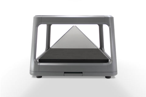
The most fundamental element to be aware of when designing content for the Holus is that each of its four displays is a triangle. What this means, of course, is that there is more width available at the bottom than the top. So, when designing a game, or designing a model, some forethought is required to make the most of the Holus platform.
The most basic concept is a static stage (one that we’ve used often for our demos). When looked at with a perspective camera - and with a slight downward tilt - we are able to make use of the full width of the pyramid near the bottom (where it is the closest), with the arena tapering away into the distance (where it is the farthest).

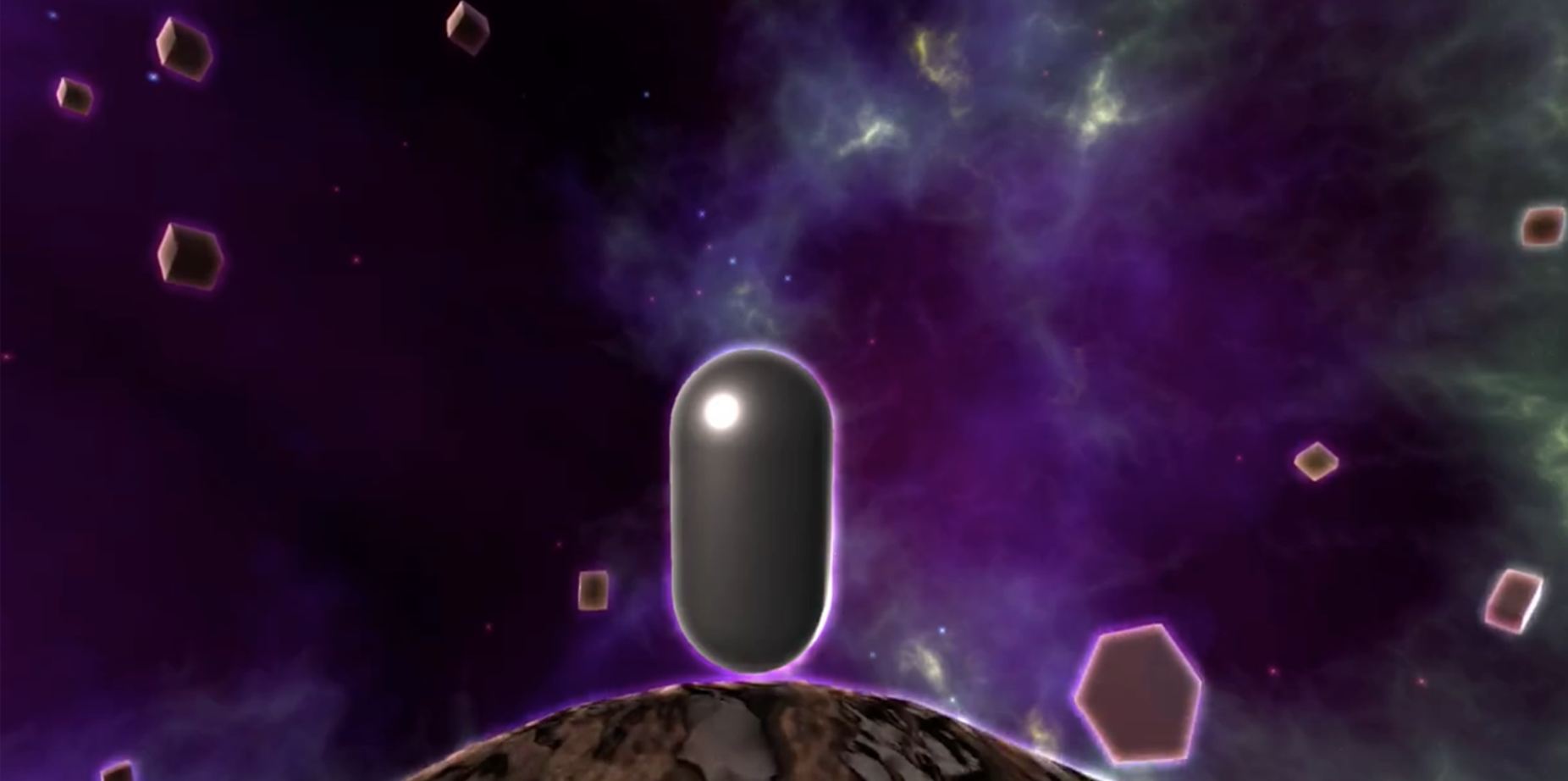
A more advanced idea may be to use a moving world that curves away like a planet in all directions (Think Mario Galaxy). Here’s a video of a concept game I made.
Of course, if you’re just displaying models, the concept still applies, though you probably don’t want to limit your creativity to triangles. So, the easiest solution is just to shrink and move the model down until it fits in all four perspectives (this is, in fact, exactly what our automatic resize application does).

- Michael Widmer, Creative Developer

