
Behind the Holus: Logo Design Concept
As a UX/UI designer, working at a young startup agency means that your skills have to be as fluid as possible wearing many different hats. Unlike larger companies, your responsibilities aren’t limited to one set of skills. It's a love-hate relationship but generally it keeps work interesting.
One of my many tasks at H+Technology is to brand our product Holus. Being in a one man army in the graphics department (there really is no official graphics department), it took months for me to design the logo. The goal for H+ is clear as always: To Humanize Technology. I began to ask questions. How do I illustrate humanizing technology? What does it feel like? What can it achieve? What does it even mean? So on and so forth. My design process was roughly something like this:
I began my research by talking to every one of my co-workers. They knew Holus best because after all, we all collectively made the product possible. I looked on the good old internet to see what I can find, even the dictionary for the meaning of words that I already knew in case I missed something. I sent out surveys to find out what people think of the product and H+Technology. I looked at architecture and folded complex origami. I wanted to learn the shapes and forms that could potentially be a logo for Holus.
Next I started drawing. I made sketches of the word Holus, cubes, drawing Holus itself, drawing only specific parts, drawing what other people think the logo should look like. I drew everything, many times, and I filled out an entire notebook with these sketches.

I didn’t know where exactly these drawings were taking me, I had good ones and bad ones. Sometimes I would forget what the goal behind the design is supposed to be. Humanizing technology. I started to think about the first time I interacted with Holus and how it felt. I recall feeling intrigued, it was mysterious, and it felt like discovering a hidden Easter egg.

I decided that the design should be minimal, elegant, yet mysterious like an Easter egg. I wanted to create a modern design that suits H+ as a tech startup, but complex (in a minimal way) enough to hide that Easter egg for people to discover. I wanted to include elements of multi-user and a non-isolating experience, because that is a part of how we humanize technology.
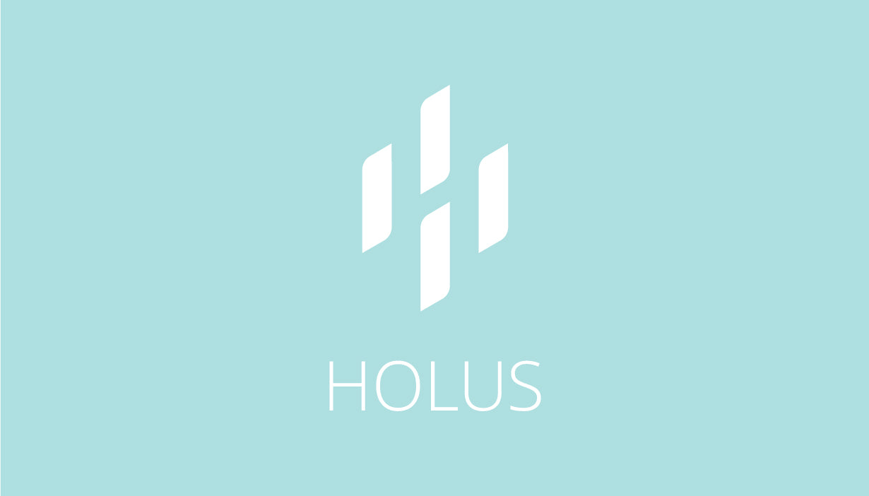
This is the final design.

The four panels placed around each other suggests a rotating movement to represent four users engaging with Holus and encouraging users to move around it. The panels are minimal in its shape, with an elegant touch of rounded corners as well as a light weight typeface. As for the easter egg that I hid within the logo, can you see it?
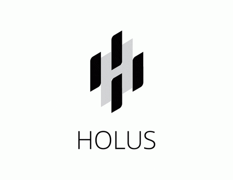
Black and white logos are used most often, however when designing the logo, I wanted something that would work with many different colours. It is important for me to create something that has the ability to be flexible so it can be applied to different designs. This is one of my key must haves for any creative work I do because I need to be able to keep my creative mind fresh by having to ability to see different uses for each design.

I hope this post sheds some light onto what it is like designing for a startup and how the Holus logo came to be. Every project I work on teaches me something new, and with this one it is no different. I remember being art blocked for a very long time and nothing I created made sense. Rather than being worried about deadlines (which are still important) I focused on doing what will pique my interest and inspire me because at the end of the day, you know that you cannot force or stage creativity.
- Jenny Lam, UX/UI Designer