The process of making 3D models out of ancient paintings
It is true that making a 3D model look like a 2D drawing is nothing new, but sometimes it goes beyond just applying a simple outline shader inside a modeling program or video game engine.
Recently, at H+Technology, we are working in a project about the Mogao Caves - also known as Dunhuang caves- where the finest examples of Buddhist art can be found, from sculptures to wall paintings.
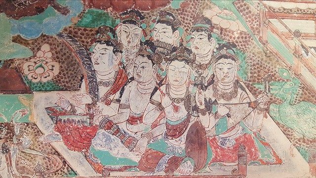
We wanted to bring to life some of the wall paintings and drawings and display them inside Holus. For this project in particular, I needed to figure out a proper way to translate the art-style of the Dunhuang cave paintings into 3D models.
I will take you through the general process that I followed to accomplish this.
At first sight, we can tell that the paintings have a well defined outline and flat colours. That was easy to reproduce by tweaking the thickness of the line and colour-picking the reference image to apply the proper colours to the model’s texture and outline.

But after doing that, the model still didn’t look like the painting, as I mentioned before, sometimes it goes beyond just applying an outline shader. The true challenge was getting the “Dunhuang style” right. What do I mean by that? If you take a closer look to the anatomy shown in the paintings, it is full of dynamism!. This is carried out thanks to the clean solid long curves of the drawing and the hyper-stylized form of the body. Having this in mind, the model needed more polish in order to recreate the flow and smoothness. I wanted to make sure that the model didn’t have sharp edges, but at the same time, that the fingers were “pointy” and long enough to match the ones in the paintings.
At this point, I was modifying the model inside Maya and constantly testing with the shader applied inside of Unity. The important thing was that the model looked and worked fine inside the engine along the shader, regardless of how distorted the model ended up looking inside Maya.

After the model was finished, the next step was to simulate the effect of ink for the outline, meaning that the stroke starts thick and gets thinner as the pressure applied to the brush changes at the end. The Tech team and myself, worked on the outline shader to make it more versatile by adding the extra features we needed in order to achieve this. For example, moving the offset of the axis where the outline was extruded from the model.
In this image you can see two things, how distorted the model looks in Maya and how it looks with the shader applied inside Unity, and how the model looks more organic thanks to the different variation of the outline.
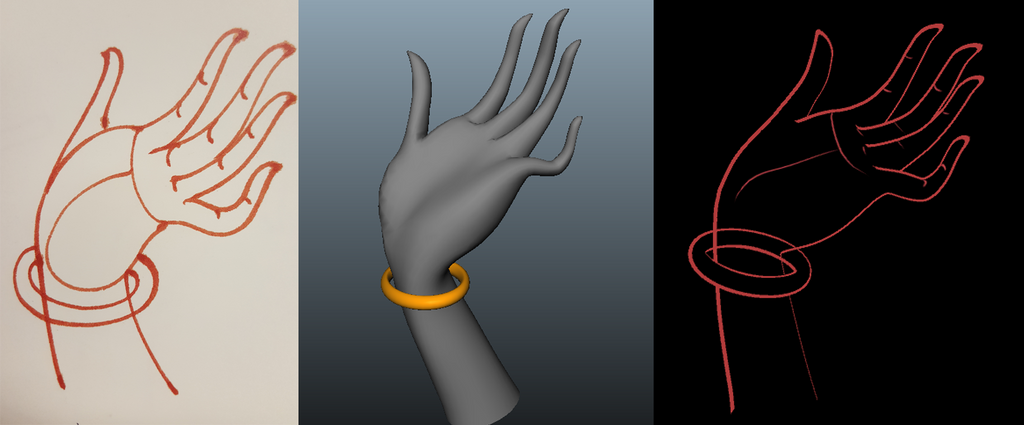
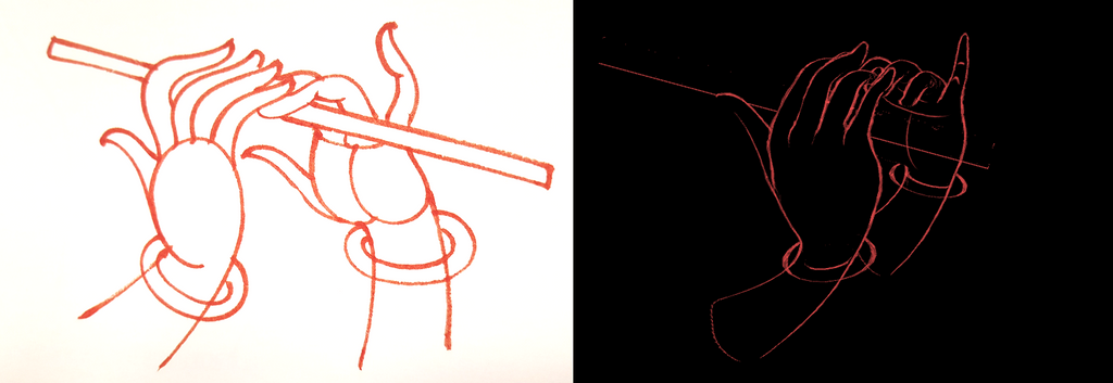
Finally, to make it look even more like an actual drawing, we wanted to recreate the dryness of the ink. This happens when the ink is running out of the brush and leaves blank spaces along the stroke, this drawing shows this effect clearly.
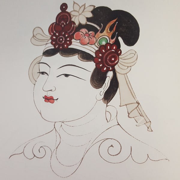
So as a last step, the Tech team merge together the shader we already have with another who has the “dry ink” effect, getting as result, something more organic and realistic.
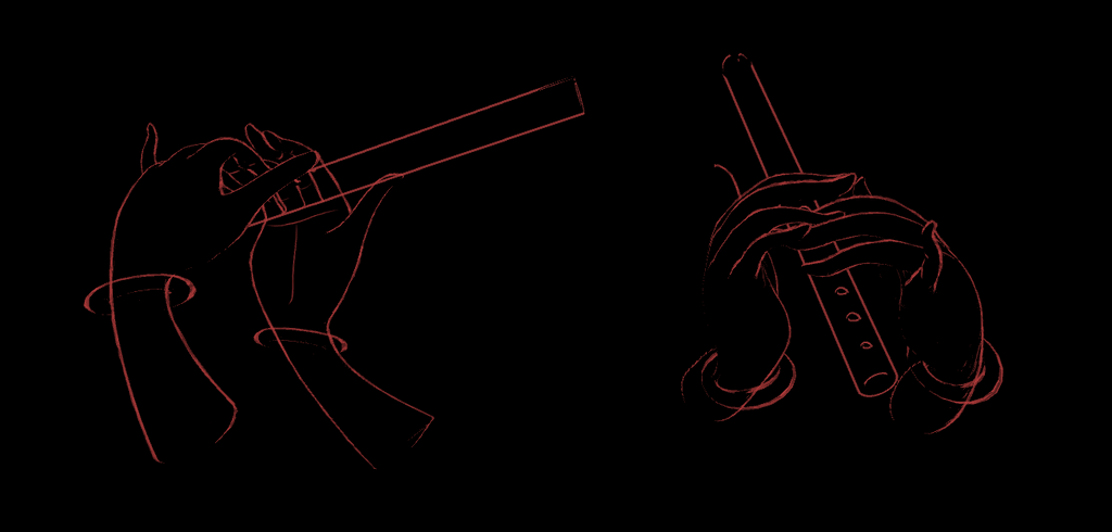
It was really interesting and fun working in these project, it was labourios at the beginning, when I was experimenting with the right settings in the shader and the proper way to create a model that looked like the paintings, but at the end of the day, we learned so much about this process and we pushed some boundaries that made us realize what are we capable of.

- Esthela Perez, Technical Artist


