Redesigning a classic game for Holus
Here at H+Technology, Yamin, our CFO, got the idea of making a game like Tetris for Holus. The concept sounded like lots of fun right away, because that meant four players at the same time playing this holographic version of the iconic game.
When we got together to flesh out the idea, we thought about different aspects for the game. For instance, how the players would interact with each other. We considered keeping the competitive aspect of the original game, but then we thought about one of the pillars behind Holus, the social aspect, that is: bringing people together. Even though the concept of having many people playing the same game is already a social interaction - regardless if it is competitive or not - we wanted to push this concept even further. Rather than having everyone isolated in their own space contending for the highest score or being the last one standing, we decided this game should be a cooperative one, where teamwork is the key for success.
And how could we achieve that?
Well, the game would have the same core mechanics of the original one: pieces start falling down one by one from the top of the game area and the players need to move the pieces by rotating and/or moving them sideways in order to fill entire lines without leaving any gaps. The game is over when the pieces stack up to the top of the game area.
For our Holus version, up to four players play at the same time in this fashion, taking one side of the pyramid as one different “screen”.

Since the game was now cooperative, we added a new twist, taking advantage of the design of Holus. Every player’s game area is shared with the people from both sides. Meaning that they have their individual play area but they share the left- and right-most columns.

Whichever piece is placed, it’s going to affect the other player as well, for the worst or for the best.

A row will not be removed until all players have completely filled it, at which point it will be cleared on all four sides. Also, if one of the players get stacked up to the top, the game is over for all players.
Prototype
As you would have noticed, we also thought about the visual style, we decided the pieces to be “made” out of jelly because we imagined how fun it would be watching the pieces squish when landing. We started making the prototype. At that time, the TGS (Tokyo Game Show) was only a few weeks away and we hoped to have a prototype to show the event.
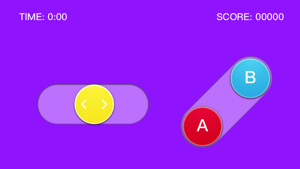
Michael started the prototype inside Unity 5; he began working on the basic movement mechanics and physics for the pieces; meanwhile, I focused on modeling the 3D pieces and making the textures; and Jenny was designing the layout of the buttons for the iPods that we use as controllers for the game. During development, each area has their own challenges and problems to solve :
UI/UX:
- How and where to place the buttons, at what distance?
- What the interface of the controller would be like? Using a toggle bar, buttons or virtual joystick?
- Which colours to use for the background and the buttons?
ART:
- How can I simulate jelly just using a diffuse texture?
- Make the art of the controller to match the style and theme of the game.
- Test different materials for the pieces inside Unity.
PROGRAMMING:
- Working on the basic game mechanics.
- Figure out how the pieces would be created so they work with the “jelly” physics inside Unity.
- Make the game work for four players.
One concern we had was the space for the game area, each face of the pyramid inside Holus is wider compared to its height. So it was a challenge adapting a game so vertical like this one to work properly in our version for Holus. The problem with this is that the game area ends up being smaller than it should and doesn't take advantage of the entire “screen” that Holus has. For time's sake, we decided to first figure out the main core mechanics and features of the game and see how it really worked when we try it on Holus.

Holotris at Tokyo Game Show 2016
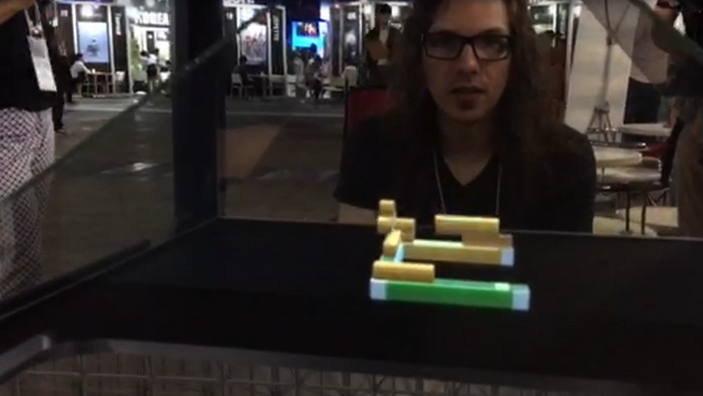
We accomplished our goal of having a prototype ready for TGS. At the event we showcased some projects that we have developed before, and when we exhibited the game, it had an amazing response! A lot of people gathered around our station to try it out. Even though the game was in alpha phase, people really got engaged with it and ended up having a really good time.

Iterations
After coming back from the TGS, we started making the pertinent changes for the game, and we began having playtests inside the office.
With the first playtests, we realized that the game ended really fast because it wasn't that easy for the four players to fill the same line. One of the reasons being that we didn't have the feature of moving a piece after it landed. Sometimes when a “z” or “s” pieces appeared, it was hard to fill the gaps, in consequence, it was impossible to fill a line. Michael came up with the idea of having a “magic cube”. This magic cube could be used to push down any floating pieces and fill gaps on the same column, so it is easy to complete entire lines this way.

Everyone in the team gave their feedback, it is necessary to mention that feedback is really important! Having the opinion of people who frequently play games as well as people who don’t, is valuable because you get to know if the game is too easy or too hard to play, if it is confusing or is intuitive, etc. Most importantly, though, is if it is fun. By having all that information, you can find that middle ground and create a game that can be enjoyed by these two different groups of people, as well as everyone in between.
 The controller had a lot of changes as well, based on the feedback received, and the addition of the magic cube as a new button. We changed the layout of the controller to be more vertical, so people could play by using just one hand and all the buttons could be easily and comfortably pressed by using the thumb. The quick drop of the pieces is achieved by tilting the iPod down or towards you.
The game so far
As you can see, the game has passed through a dynamic process of constant iterations, resulting in a solid and fun game.
These are some features recently incorporated.
- People sometimes find it more intuitive to swipe on the controller to move the pieces and other people prefer to have digital buttons. Considering that, the controller has two versions now: one is a touch mode using swiping gestures to control the pieces, the other is a mode with four buttons. Players can choose between these two modes before the game starts.
- The problem with the ratio of the game area is fixed now, thanks to a shader that Michael implemented that stretches the bottom part of the game area so it looks that it covers more area at the lower part.
- The game now has the feature that allows a piece to move for a brief period of time when it lands before it gets completely locked down.
- The game has implemented sound effects and particles.
The game in general has gotten better with each iteration. With more polishing, I am sure that we will have a finished version of the game very soon, but we want to know your opinion!
What other features would you like to see implemented in the game?
Credits
Michael Widmer - Programmer / Game Design
Esthela Perez - Technical Artist
- Esthela Perez, Technical Artist


